Sunday, 22 February 2015

Animal Cruelty In Abattoirs

        Between 2009 and 2011, Animal Aid secretly investigated and filmed inside 9 randomly chosen slaughterhouses in the UK, and shockingly 8 of these were found to be in violation of animal welfare laws, subjecting the animals to suffering and cruelty. The films showed animals being deliberately beaten, kicked, slapped, burned, thrown into pens, picked up by fleeces and ears, and stamped on. Animals were recorded being improperly stunned, meaning they were still conscious as they went to the knife.

        Even the 'high welfare' establishments, such as those approved by Freedom Foods or The Soil Association, were guilty of breaking animal welfare laws, and were found to be no better than standard abattoirs. 


PETA report on animal cruelty in organic meat production.

An interview with a former slaughterhouse employee (who's role was cutting the animals' throats), which reveals a shocking level of cruelty and disregard in a pig slaughterhouse.

A Guardian article, which details the reaction from supermarkets when faced with Animal Aid's findings. Their response is to call for the installation of CCTV, to monitor standards of treatment in abattoirs.

Friday, 20 February 2015

WWF - Brief Analysis

        Before developing our responses to WWF's brief, it is important to understand exactly what the client is looking for. This universal set of questions, which can be applied to all briefs, should help to clarify what outcomes we are aiming for, what messages we should be communicating and who we should be communicating these messages to. Although the brief itself is fairly vague, the accompanying Living Planet Report contains a vast amount of information, so it will undoubtedly be necessary to condense the report in to several key points, so as not to overcrowd our response with information.  

What problems are identified by the brief?
Since 1970, worldwide species populations have declined by 52%, our current demands on nature are unsustainable (we would need 1.5 Earths to meet our current demands), and we are eating into our natural capital, which ultimately means that we are jeopardizing both our own future, and the future of the planet. The rapid rate of change is a recurring theme throughout the Living Planet Report, prompting the question, what will our planet look like in 40 years time?

What is the brief asking you to do about it?
The brief is asking us to take the findings of The Living Planet Report, and make them relevant and accessible to a younger audience, either through a short film (maximum of 2 minutes) or no more than 8 presentation slides. WWF want the audience to recognise that the relationship between us and the planet is reciprocal, and that there are better and alternative paths, ways of harmoniously coexisting with the planet. 

What is the brief trying to achieve?
WWF wishes to achieve a long term change in behaviour, galvanising the audience to get involved and take action in order to change the future of the planet. While it is one thing to make people aware of a problem, it is another to engage them to the point of action, to make them care enough to stand up and take responsibility.

Who will benefit?
WWF wishes to communicate messages which have a global impact. A successful response will not only benefit the audience themselves, and their generation and future generations to come, but people across the planet, as well as Earth itself and all its inhabitants. On a more cynical note, WWF would benefit, from a potential increase in donations, but also from positive public image for drawing attention to a significant global issue.

What is the message?
WWF's main message is that the relationship between us and the planet is reciprocal. The Earth needs us as much as we need it. Life on Earth is interconnected; our every action impacts on the health of the planet, and we are currently living beyond our means. Our own future is currently in jeopardy; we need to change our way of living, and reduce our ecological footprint to match biocapacity.


Who is the audience?
The main target audience is 14-24 year olds. Those with the opportunity to shape their futures. WWF want to inspire this new and upcoming generation to understand the impact of our lifestyles and actions on the planet, and begin forging new pathways and alternative ways of living. However, it seems a lot to put on the shoulders of this young generation. This challenge is the responsibility of everybody on the planet, and WWF should be communicating their message to those with the power to make changes. That doesn't just mean the future custodians of the planet, but those in power now.

How will the message be delivered?
Rebecca and I intend to produce an animated response to WWF's brief, using stop motion techniques. We intend to use a combination of paper/material cut outs and real world objects. Animation has proved effective in the past at communicating concepts and ideas which are difficult to grasp or hard to show in other formats. From short animated documentaries to moving infographics, animation has also has a proven ability to convey relatively large amounts of information is a short time through strong visual representations, which are worth a thousand words. WWF wishes to avoid a regurgitation of facts and statistics, we need to look for the story behind them, in order to make the audience really care. 

Can you foresee any problems in responding to the brief?
The Living Planet Report contains a vast amount of information, and the maximum 2 minute film length means it will be impossible to include all aspects of the report. Choosing which strands are more vital and significant than others will be a challenge, as will condensing the facts and statistics into a coherent and convincing narrative. On a more practical level, producing a 1 to 2 minute animation in less than 6 weeks is a huge undertaking. Rebecca and I will have to be highly efficient, and consider carefully what it is possible for us to achieve.

        What else we have to consider is what we as artists and individuals wish to get from completing this brief, aside from aspiring to save the planet. To me, the most important outcomes from this brief will be creating a body of design and concept art which is worthy of inclusion in my portfolio. In a similar vein, I hope that we will produce a film which I can be proud to show as part of my showreel (so far I am not particularly pleased with the body of work I have to choose from). As this is my first experience of working collaboratively on a project, there is also the opportunity to watch and learn from Rebecca, picking up skills and knowledge from her to expand upon my existing abilities. Finally, as with all competition briefs, the ultimate goal is to win, although this is low on my list of priorities. However, it would be a big confidence boost to have our work acknowledged. 

Initial Designs - Character & Environment

        Having come up with a number of basic ideas and concepts, Fiona and I decided to divide the design workload, with me taking the characters and her handling to initial environmental designs. I really enjoyed being able to spend an afternoon sketching out ideas, as after the Character & Narrative module's emphasis on Maya, it seems like an age since I have done any drawing, inking and painting.

        
        These three are just my first attempts. I tried to focus on using disparate shapes for each character, to create easily identifiable silhouettes, as in other projects my characters have sometimes been too similar to one another. So I began with a core shape for each character: a pear, a rod and a square. Oddly, the butcher on the left eerily resembles The Boxtrolls' Mr Trout, although I was in no way referencing this character. I also had a strong inclination that their skin should be a sickly shade of green-grey, to correspond with the squeamish nature of their work, but also mirror the cold fluorescent light of many abattoirs.

        Fiona and I are only intending on having two butchers in our narrative (to keep our already ballooning workload down, as well as to not overcrowd a short film). After consulting with Fiona, we have decided on the tall & thin, and square characters. We felt that they were already developing personalities, and were the most distinct from one another. The stocky square butcher automatically comes across as the gruff, hardened, (perhaps bullying) authoritarian character, while his gangly colleague seems softer, more impressionable and less intimidating; he could easily be bossed around by 'the stocky sod' (as Fiona charmingly referred to him). 

        As I am also undertaking some of the prop modelling and set design, we have decided to each take on one butcher. Working from my initial designs, we will further develop and put our own stamp on one character, as we would both love to develop our modelling skills, and experience all facets of the stop motion process. I chose to work with the gangly chap (I'm thinking of naming him Gordon or Gilbert), and Fiona the stocky man.

        While I was focused on the characters, Fiona began to consider the set, sketching a rough layout and a floor plan for me to add props and details to. Although we have referenced images and videos of existing abattoirs, we also have to take in to account costs and timings; creating a vast, cavernous set is probably beyond us at this point. We have tried to be efficient with the set, focusing on the core areas of a slaughterhouse, such as the corrals, the area where the animals are slaughtered, and the hanging rails of carcasses. 


        We are hoping to build the walls of the set so that they are relatively lightweight and removable, allowing easy camera access to all areas, as well as to make transporting the set more viable.

        I am under express instructions from Fiona not to be too precious with my drawing at this point...which I will try my best to bear in mind.

        Stylistically, we are looking at a variety of dark and eerie stop motions, such as Cannis and Peter & The Wolf, which we feel reflect the tone and atmosphere which would best suit our topic.


WWF - Living Planet Report

        The cornerstone of WWF's brief is the Living Planet Report, which details how our current lifestyles impact upon the health of the planet, and ultimately how said lifestyles are unsustainable in the long run. As the full report is 180 pages (even the summarised report came in at a fairly hefty 36 pages), Rebecca and I felt it wasn't a reasonable use of time and resources for both of us to read the report. Consequently, I volunteered to read and analyse the Living Planet Report, and to select the most important information, which could form the basis of our response.


        Having read the report, we can see that the main focus is not in fact endangered or iconic species; these are just a small part of the overall declining health of our planet. While our initial ideas may not be entirely redundant (the plight of animals can be very moving and emotive in the right hands, as numerous David Attenborough documentaries have demonstrated). However, we must weigh up whether this would be the best approach to actively engage the target audience, or whether other information strands from the Living Planet Report would have a stronger impact.

WWF - Initial Thoughts & Ideas

        Having decided on the WWF brief, Rebecca and I began to jot down our initial ideas. Although we realised that reading the Living Planet report was a vital stage in understanding this brief, these notes and thoughts were made before we read that report. From the scant overview given in the brief, and WWF well known association with endangered animals, we naturally assumed that the main topic of the report would be the impact of human lifestyles on the population levels of thousands of species. The brief also encourages us to consider the importance of biodiversity and iconic species, further fueling our initial impressions that animals are at the centre of the report.


        While animation is very good at literally visualising facts and statistics through graphs, charts and infographics, we thought that in order to inspire change we would have to work at establishing an emotional connection with our target audience. Otherwise we risk creating awareness without action, which the brief specifically wishes to avoid. So, Rebecca and I began to think of visual styles which might fit the brief. We decided that something wholesome, traditional and with a handmade finish might be suitable; something which suggests the fragility and beauty of the planet, and stands apart from the industrialisation ad rapid development which is contributing to its destruction.

        Some of the artists which we referenced were Raymond Briggs, Joanna Quinn, E. H. Shepard, and Peggy Fortnum. Each of these artists has a very soft and appealing style, yet with a transient quality to the line and colour which would perfectly suggest how our planet and its species are endangered.


        However, we are not aiming to produce a hand drawn, 2 minute animation. In our time frame that is both impractical and overly ambitious (the longest animation I have yet produced is 40 seconds). However, Rebecca and I do hope to incorporate a hand drawn aspect by using paper cut out figures and objects. 


Ratatouille's credits have a bold, cut out style.

The Bear & The Hare, an excellent example of mixed media,
and stop motion animated cut outs.

        Consequently we can keep a traditional and wholesome aesthetic, but hopefully work more efficiently, either by using stop motion and Dragonframe, or possibly even scanning in hand made assets and animatig them using After Effects. It had also crossed my mind that we could incorporate an element of pixilation into our film: if we were to use paper models of our planet and its environments and/or species, it may be an interesting visual metaphor to see a pair or human hands cut. tear, fold and crumple these objects, to show how we use, abuse and manipulate our planet's resources.

        While I began to analyse the brief, and dissect the Living Planet Report, Rebecca very helpfully undertook some further research, into both the visual style of cut out animation, but also animations, films and documentaries which have dealt with similar topics of nature and the environment:


        One final thing. The brief is very specific in that it wants our response to inspire action, not just awareness. After all, there have been numerous campaigns and documentaries which highlight similar topics to WWF (Al Gore's An Inconvenient Truth, for example presented a devastating argument), and yet so far there has been no great reform or change. So how do we galvanise a new generation? Rebecca and I were both reminded of some First World War recruitment posters, which shamelessly guilt trip the viewer into feeling they should enlist or contribute.


         Somehow, we need to imbue our animation with a similar immediacy. It is not enough for the audience to imagine beautiful animals and far away countries suffering. For WWF's message to be truly heard, we need to emphasise how decreasing wildlife populations and unsustainable use of the planet's resources will affect those in developed and wealthy countries; it will affect the target audience and their lives.

Collaborative Practice - Brief Selection & Contract

        The second Studio Brief for Responsive requires us to work with a collaborative partner to complete one of the YCN or D&AD New Blood competition briefs. Although we were advised that working with close friends may be problematic, resulting in disagreements and tensions (apparently we should never work with someone we are not prepared to sue), my collaborative partner and I feel that being familiar with one another may be beneficial.

        As Rebecca and I have been good friends since we began this course we are well acquainted with one another's style and abilities. Fortunately, we have complimentary skill sets: while I prefer traditional methods yet lack any digital know how, Rebecca has a stronger knowledge of software such as Photoshop and Illustrator, yet still maintains a hand drawn aesthetic. We also have a similar work ethic, which should help avoid any conflicts regarding an imbalance in the workflow, as we are both likely to pull our weight in this partnership.

        We chose to work together from the outset, rather than negotiate a partnership with an illustrator or graphic designer, as we were both wary of being expected to take sole responsibility for animating another person's designs. However, before diving headlong into this project, as with the main individual practice brief, we each selected three of the available competition briefs which we were interested in completing.

        I chose the Wetransfer brief as it stood out from the others as being different. The vast majority of the briefs are centred around advertising and branding, whereas this brief is not. It offers the creative freedom to consider our own target audience, and there is no set purpose for the illustrations; we would get to determine that too. Although this creative freedom may initially sound liberating, it will undoubtedly also prove challenging. Thee are few instructions or guidelines to reference or fall back on, so it will be important to set clear goals and intentions from the outset, especially if working in collaboration. Ultimately, the appeal of this brief centres on how well it will support my practice as an animator. Although there may not necessarily be an animated outcome, envisioning and illustrating how I imagine myself to be in 10 years time has parallels with character design.

        The second brief which I selected was for Moo. I chose it as it sounds fun. The brand, Moo, sound friendly and open, and , unlike some of the 'dryer' brands, don't have too many stringent ideas and requirements which must be adhered to. While many of the briefs are geared towards a graphic design type outcome, Moo provide an opportunity to create an animated outcome (developing relevant skills and creating something which could be added to our showreels), an indeed encourage 'playful' and creative representations of their 'design works wonders' philosophy. While many of the briefs, for banks, insurance companies etc. felt irrelevant and left me uninspired, when reading Moo's brief, I could quickly begin formulating ideas. I feel it is important to work with briefs that inspire enthusiasm, so that you are passionate and motivated about your work.

        The third brief is the one which I like the least. Topdeck Travel's brief poses the greatest potential challenge. I have no great mind for advertising, and am not particularly proficient in harnessing the power of social media as a tool for promotion or communication on a large scale. However, of all the advertising briefs this was by far the most appealing. I am close in age to the companies existing antipodean demographic, which should helpfully assist me in targeting a similar UK market. The travel aspect is also intriguing, particularly the more unusual, off the beaten track destinations in Eastern Europe, which would provide the opportunity to explore some unusual visual styles. The London Red Bus (from which the company takes its name) would also work as a strong, recognisable symbol. As Topdeck wish to move away from conventional, printed travel guides, this would be an ideal use for animation, which could incorporate easily recognisable visual styles for the different locations, centred around the Red Bus, either in a series of adverts. or a single one. In a world full of live action travel adverts, I believe animation would stand out.  

        When Rebecca and I came together to discuss our choices, we discovered that we had both selected Wetransfer's brief. However, after much discussion we decided that it would be challenging to work on this together, as it is ultimately a quite personal vision of our futures. Although some partnerships have found a way to combine both parties' aspirations into one image, it would not have worked so well for us, as our hopes are quite different. 

        Rebecca's second brief was Pantone's; to reimagine your hometown through a new colour scheme. Although this brief had also caught my eye, and sounded interesting, I just couldn't see how this was as relevant to our practice as either Moo's or WWF's, Rebecca's third choice. Both of these brief had a lot of potential and mileage, and we could have worked with either, but in the end we chose the WWF brief, as it was more than just an advertising brief; there is a strong an important message which needs communicating. 

        Regardless of our confidence in one another, we were asked to fill out a contract of sorts, to clarify our individual roles and responsibilities, and prevent any arguments further down the line about who should be doing what.


Friday, 13 February 2015

Food For Thought - Collaboration and Initial Ideas

        As I wanted to use this module as an opportunity to gain further experience of stop motion, my prime area of creative interest, due to the sheer volume of work that would potentially be involved, I judged that it would be most sensible to collaborate. Prior to the module briefing we had been made aware that we may be working in groups, so I had already been in conversation with a number of possible collaborators who were also interested in stop motion.

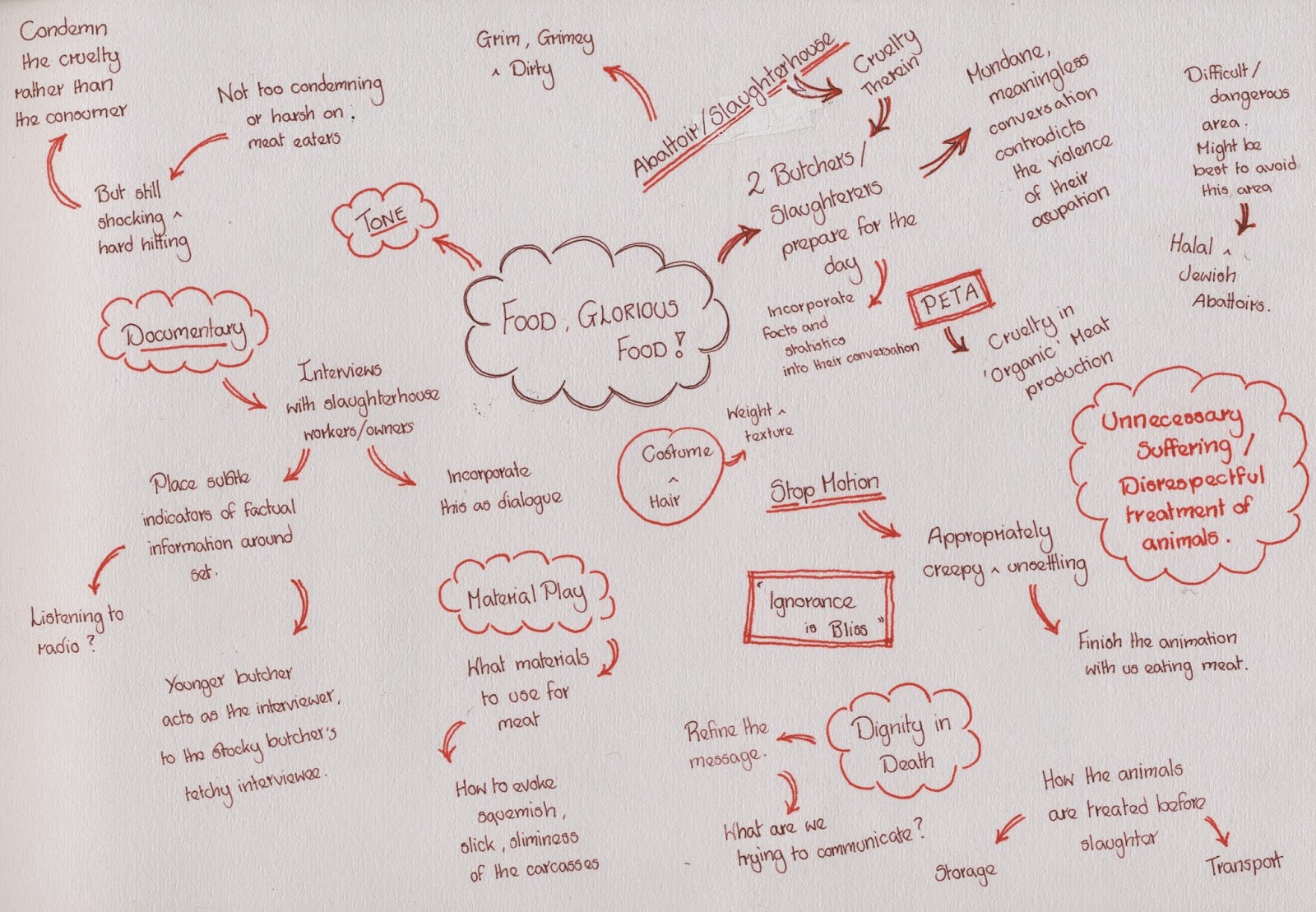
        After being informed that we could still pursue individual projects, some of these potential collaborators chose to work alone, drafting in co operative assistance. Fortunately, Fiona was still interested in working collaboratively, and we had fairly similar ideas about the tone and subject we wished to use for this animation: something dark, possibly concerning butchery or slaughterhouses. 

        There has certainly been a fair amount of news coverage on this topic recently, from the on going implications of the horse meat scandal, to more recent allegations of widespread animal cruelty in the meat industry. These would be prime topics for an animated documentary, which excels at shining a light on difficult (either as they are sensitive or potentially offensive, statistics heavy, or just too microscopic to visualise) subjects.


Applied Animation 2 - Food Glorious Food!

'There is no sincerer love than the love of food'
-George Bernard Shaw       

With an emphasis on providing us with greater creative freedom, and encouraging us to begin developing our own briefs and taking greater responsibility for our own projects, the brief for Applied Animation 2 is quite vague. The main requirements? It must concern food. And be a documentary animation.

        Aside from these two points, the world is pretty much our oyster. We could look at food growth, production, preparation, consumption, dietary requirements et. al. It could be hard hitting or comedic in tone. We will need to identify our own audience. We could create Creature Comforts style animated interviews (although as the interviews in Creature Comforts are taken out of context, it is debatable whether they can be classed as documentary), fact heavy info-graphics, or a docudrama. We can use any animation style we feel is appropriate.

        Another new consideration is who to work with. Until recently, every project and brief has been undertaken individually, with everyone completing every stage of a module on their own, from beginning to end. While that is still an option with the Applied Animation 2 brief, there is also the option to work collaboratively in small groups of up to three, or co-operatively, where classmates can be drafted in to lend assistance with specific processes based on their skills and strengths. This is a lot to take in and think about. 

        The potential to work across multiple groups and projects could easily result in an overload of work. It is important to bear in mind that the resultant animations are intended for public exhibition at the end of the year, and so must be of high quality, broadcast standard. Quality, not quantity (although the 1-2 minute guide time is longer than any animation I have attempted thus far) is the key.

        The briefing provided a number of interesting prompts to get us thinking about food, not just as a subject, but how best to visually represent it. Food is integrally linked to our sense of taste, smell and touch, so how can we simulate that sensory experience using only visual and audio? Can we exploit intrinsic links between certain sounds and tastes/smells?

        Also, food can be an emotionally charged topic. I have known arguments to break out over vegetarianism. Is animation well placed to address some of the more controversial or distasteful topics surrounding food? If the right tone is struck it is possible that an audience may be more open to and less antagonised by an animated documentary, but get the tone wrong and it could come across as patronising. It is important to bear in mind that while some animations are clearly aimed at adults, the medium is still largely perceived as being for children. Perhaps this misconception would allow an animator to spring a topic upon a viewer that they would not be expecting, and would not otherwise pay attention to?        


Thursday, 12 February 2015

Pitch Boards Volume 2

        I took some time to consider the feedback I was given, and consider how I might incorporate the suggested improvements into my pitch boards. The most common comments , not just from my peer review group, but also tutors and other classmates, were regarding the volume of text on my boards, and the discrepancy between page formats. Consequently, my first step was to change the Character & Environment board to the same landscape format as the other 3 boards. I also chose to make this the second, rather than the fourth board in the sequence, as I felt that the designs should take precedence over the posters and online banners. After all, without the designs, there would be no posters.


        I also took note of the suggestion to add colour to the posters, as really the lack of colour has little relevance outside the context of the animation. It also corresponds better to the 'brighter future' theme if the images are bright and colourful.

        Despite removing a large amount of text from the character & environment board, and attempting to make the text on the poster board more concise, there still appears to be a lot of type. Yet I feel that everything I have included is necessary to helping people understand my proposal, particularly if the boards are being viewed without any written or spoke accompaniment. 

        This issue of whether the boards are clear and easy to interpret became more apparent as we switched groups, viewing pitch boards without the respective artists there to explain or describe their projects. Many of the boards which I viewed had no text, making it hard (and sometimes near impossible) to decipher what the product or intention was, let alone the audience. I therefore feel that text is vital, although in future I will need to make a concerted effort to be less wordy, and communicate as much as possible through imagery rather than prose. 

        This is the last opportunity for us to receive peer feedback in a formal session, as after this Progress Critque we will be expected to take in to account the responses to our proposals and pith boards and begin work on the final resolutions. The feedback I received was as follows:

Effectiveness of the proposed concept/response in relation to the brief.
Strengths:
  • Retro style fits in well with the childhood characters of the fathers' era. Very nostalgic in presentation.
  • Very well thought out concept.
  • Attention to style, very consistent.
  • Audience well considered.
Suggestions:
  • More examples of context, where it is going to be used.
Extent to which the proposed response solves the identified problem.
Strengths:
  • Delivers message simply on the importance of reading through text and image.
  • Connection with both parent and child.
  • All elements well thought out.
  • Delivery is really good.
  • Answers the brief very accurately.
Suggestions:
  • Edit the poster to fit more comfortably in the underground image.
  • Other means of reaching out to the audience?
Appropriateness of the response to the identified audience/context.
Strengths:
  • Connects well with parents, the father in particular by using a male figure in animation.
  • The 'no face' choice smartly makes it an everyman figure.
  • Very appropriate to the audience.
  • Style appeals to both - not too adult, not too child friendly.
Suggestions:
  • Perhaps include a scene from the parents' POV, currently only from the child's perspective.
  • A few more examples/ideas of how it reaches to the children.
Visual quality/content in relation to the proposed response.
Strengths:
  • Clever use of black & white and colour to show contrast between life with reading and without.
  • A lot of effort is evident through character design and story.
  • Colour scheme is interpreted very well/appropriately
Suggestions:
  • Perhaps use Photoshop to keep texture but keep within the colour restrictions to fit in with the font, to reduce contrast.
  • Make the logo (ugly one provided by the company) less overpowering. A bit smaller maybe, to avoid stealing focus.
Presentation of the work with regards to the quality, quantity and appropriateness of text based and visual information.
Strengths:
  • All styles are very well presented.
  • Audience is well considered and presented well. 
  • Arranged well, nice flow, easy to follow.
  • Shows effectively the ideas and concepts.
  • The appropriate retro style choice and reference.
  • It's possible places of use as a campaign.
Suggestions:
  • Possibly add clear borders/frames to the storyboard images.
  • Improve alignment of image and text.
  • A little too much text.
  • Consider including titles e.g. for the storyboard, to make it easier to show what element we are looking at quicker. 

         I am fairly happy with this feedback, as the strengths and areas for improvement are fairly consistent across both reviews. I will further look into reducing the amount of text, as well as better integrating Save the Children's bold logo with my softer, hand drawn aesthetic, and making said logo less obtrusive on the supporting contextual material. Another common suggestion seems to be further considering how the proposed animation will be viewed by children, so I could include mock ups of the film being viewed either on TV or digital devices, or examples of the posters being displayed in schools.

        My main task however, now that I am satisfied my concept is fit for purpose, is to complete the full 2 minute storyboard.

Sunday, 8 February 2015

Pitch Boards Volume 1


        In support of my written proposal I produced these four pitch boards, which I could then use to present my intentions to the same small group we had worked in previously for the peer review sessions. Their feedback was generally positive, but I did feel at times that the fact we weren't familiar with one another was detrimental, as we perhaps didn't feel comfortable enough to give an in depth critique of each others' work. This is most apparent in the response I received to the following questions:
  1. Does my proposal communicate the appropriate concept? Yes, as it focuses on the core message of 'Just 10 minutes a day...'
  2. Does the pitch meet the specifications of the brief? Yes.
  3. Do the boards communicate the proposal effectively? Yes.
  4. Is the response suitable for the target audience? Yes, as animation is ideal at appealing to a broad audience, from children to parents.
  5. Is the choice/use of media appropriate? Yes. Stick to coloured pencils and a hand drawn aesthetic.
  6. Is the response achievable in the time available? Yes.
  7. Is the response appropriate to the identified context? Yes.
  8. Is the visual concept/direction appropriate to the tone? Yes.
  9. Do the deliverables meet the mandatory requirements? Yes.
  10. How can the response be improved? Include contextual reference, parental character designs, plot out full storyboards, possibly include more examples of where the posters would be displayed.

        Fortunately, the written feedback I received was more in depth and informative, providing me with a greater understanding of areas I could improve upon before we next present our proposals to one another.

Strengths in the proposal:
  • Strong character design - can see thought has been put into it.
  • Consideration has been given to where posters will be placed in order to reach the attention of busy parents, who are possibly the ones who need to see it the most.
  • Managing to work well with the restrictive prescribed colour palette.
  • Thought has been put into the different formats the campaign could appear in (the website banners look real and professional).
  • The simple line drawn background. Character seems to be the more important element and that has been considered in the designs.
  • The response suitably exploits parental emotions of guilt, and is therefore more likely to provoke a response.
  • Successfully made use of the mandatory requirements.
  • The response appropriately conveys the aesthetic of children's books.
  • Exhaustive analysis of the brief, and your ow response.
  • Great consideration of context.
Areas for improvement in the proposal:
  • Perhaps the drawings are not currently using the exact given colour palette.
  • Potentially too much information of the 4th board.
  • Potentially too much text.
  • Only the 4th board is in portrait format...they should all be one or the other.
  • Possibly don't need the 'exterior box' line on the boards.
  • The two boy characters are very similar. Hard to distinguish between them.
  • Texture and tone. I know that you are excluding colour in parts for effect, but this could leave some areas looking flat. Could use more line as texture and pattern.
  • More contextual research.
  • Presentation boards should all be the same format - looks professional.
Questions that need answering:
  • Will there be sound? Voices? Backing Music? Yes, there will be a voice over by a little boy, and ambient sounds, but not music.
  • Will the posters be black and white? As a single image, the lack of colour has no meaning unless everyone has already seen the video. Perhaps making the posters colour would better match the brighter future slogans and message.
  • Will it be pencil coloured, as shown, or digitally coloured? Pencil, to keep the handmade, picture book aesthetic.
  • How many frames will you present for your final storyboard? I'm not yet sure. Most campaign videos seem to be around 2 minutes long. 18? Would fit comfortably on 2 or 3 boards.
  • How are you going to present the storyboard? 6 frames per page on LCA storyboard template.
  • How much text do you really need? Keep text to a minimum. A picture can communicate so much more than words.
  • How can you make each page more uniform? Keep all boards to landscape format.
  • How can you further differentiate the boy characters? Different hair colours (dark and blonde) and individual colour schemes, as far as the prescribed palette allows.
  • How can you give the boards a more deliberate ordering?

Project Proposals & Presentation Boards

        Having taken into account the feedback which we received during the peer review sessions, the next stage in developing our responses to our competition briefs was to write up a more in depth and specific proposal. When working on  live brief for a client, such a document can also be used as a kind of contract, so that you and the client can jointly agree what is expected and what will be produced, in order to prevent any future disagreements.

        What is important to remember is that there is no magic formula when it comes to writing proposals of preparing pitch boards. What is appropriate will differ from project to project, so you must evaluate each brief individually.

1. You should have clear aims and objectives. A proposal should articulate what you are trying to achieve/do, and include your
  • Overall aims - impact, intentions.
  • Specific aims - impact upon whom or what? Outcomes.
  • Objectives - how? Outputs.

2. Be SMART:

  • Specific - details exactly what needs to be done.
  • Measurable - achievements can be measured in units or success criteria, e.g. an increase in the number of children reading well by age 11.
  • Achievable - the required resources, scope and scale are within you capability or capacity.
  • Realistic - the objectives are possible to attain. This is important for keeping  motivated.
  • Time conscious - be aware of the period of time you have for the project. Set target dates, and a defined schedule or timetable.

3. Use words from the brief.


4. Justify the need for your proposal. Who needs it? Why? Where is the evidence? Use statistics from the brief. Don't make sweeping generalisations or empty statements.

5. Describe the audence. Demographic, location, lifestyle, industry, values, will they engage?

6. Describe your motivations. These could be goals, ambitions, success criteria, values (political, environmental, social, economic) etc.

7. Consider the reader. Make the proposal easy to read. Use a professional template and an appropriate tone. Don't repeat yourself, and make sure you get at least two proof readers to check the grammar and spelling.

8. Eliminate vagueness. Be specific and clinical.

9. Visualise the ending. Begin your proposal with a vision of the ending in mind. This will help, as you'll have a clear sense of when you are finished.

10. Assume nothing. Except that the reader of your proposal knows nothing about you, your skills, or the project. Explain everything.

        Tell the story of the brief, highlighting what is central and important in a clear, effective, concise and professional manner. Also bear in mind the requirements of the brief, and the submission guidelines, as there is no point putting your heart and soul in to a project if it doesn't conform to the specified mandatories, formats and deliverables. Submit your work on brief and ON TIME.

        There probably won't be time to do everything that you want. What is the bare minimum that is expected in the brief? Often it is your own expectations, rather than those of the client, which are excessive. Be ready for creative compromise - you don't need to actually do something as part of a proposal, it can be enough to just show it.

        What are you actually being asked to produce? A product, a concept, or a proposal. Consider what it achievable in the time frame. Don't put unnecessary pressure on yourself.

        The identified audience won't actually see your submission...the judges will. Try to anticipate what the judges will be looking for, such as research, understanding, suitability, real world impact, context etc. How does your concept fit in the real world? How does it exist? How will people interact with it? What world do your characters live in. Look deeper.

         Is the product essential to the brief? Do you actually have to physically make something, or can the concept be explained without the product? If not, what do you actually need to produce. Your resolution could be between a proposal and a finalised product.

        With all of this information in mind, I have rewritten my proposal, trying to make it as clear, understandable and specific as possible:

        The second part of an effective pitch is effective presentation boards, which support what you've been communicating in the proposal. We will be producing between 3-5 boards (unless otherwise stated in the brief), with a clear purpose behind each one.
  • Impact, start at the end. Show the concept design and style of your final resolution.
  • What is the product, the range (episodes, flavours etc.), how it will be distributed. Consider franchising, social media, online promotion, series.
  • Audience, function and context. For this board, I will be mocking up online banners and campaign posters which will support the animation I am storyboarding. Other possibilities would be coinciding apps and e-reader stories, to engage with the digital age, or even branching out with a publisher to produce a range of tie in story books for children.
        Think before you do (to save time, effort and money), plan before you act (to save time and resources), and question everything your tutor's have ever said (in order to differentiate yourself).       

Peer Review - Feedback

        In small groups (I was with two Illustration students) we were given the opportunity to briefly present our work, both the written proposal and our visual development thus far, and ask questions which will help us further develop our responses.

The questions which I had, and required feedback on were as follows:
  1. What balance of positive to negative story would be the most effective? The group thought that the contrast between the two moods/tones would be an effective way of evoking an emotional response from fathers/adult audiences, but that the story should end on a positive and hopeful, rather than down-hearted and pessimistic note. They felt that this would be a better way of encouraging lasting change.
  2. Do you think positioning the animation as a story that is being read, with a narrative voice over, is a good direction to head in? They thought that this idea had potential for encouraging parents to read to their children, particularly in relation to the next question... 
  3. If the animation does have a narrative voice over, would it be more effective if it were made by the father or the child? I liked the group's suggestion of having the child read the majority of the voice over, with the dad occasionally stepping in to help with some of the larger, trickier words.
  4. What in your opinion are some widely known/enduring stories or illustrations which I could use, to place the aspirational child in? Charles Dickens, Quentin Blake, The Hungry Caterpillar, Alice in Wonderland, The Tiger Who Came To Tea, Guess How Much I Love You...the list is endless. The conclusion that we came to was that the most important factor is using styles with enduring appeal, which won't irritate of alienate the target audience of fathers.
  5. Charity campaigns often have a fair amount of screen text (statistics etc.). Do you think that this is necessary, or reduce the information to the core message of '10 minutes per day...'? The group felt that it was a better strategy to encourage, rather than shamelessly guilt trip parents by forcing endless statistics down their throats. Having being exposed to various charity campaigns we can say that this tactic is often off-putting and disengaging, and in this case would interrupt the narrative and emotional impact. Any statistics could be included in the voice over, or blended into the scenery, i.e. on bill boards or posters in the storyboard.
        This session was helpful, and I received some useful feedback which I can definitely incorporate into my work. It was also encouraging to see the positive reactions which my initial ideas received from people I am unfamiliar with. This has given me confidence that I am working along the right tracks.

        Something which I need to look into however is the project pack. I had glanced at it briefly, but need to take greater consideration of the prescribed colour schemes, logos which must be included and designated fonts before taking my work any further.

        One final note. Since this session, I have had a change of heart regarding the narrative of my storyboard. Rather than have two separate protagonists (one who is and one who isn't read to by their father) I have decided to focus on just one boy. Initially, he will struggle to read and wistfully long to be like his classmates, but once his father begins to read to him, his prospects brighten. I felt that it would be more uplifting, to show a child escaping his illiteracy, rather than my more pessimistic first draft, which lacked a positive outcome for the 'bad' reader.