While we may not have considered them in great depth for other modules, titles can play an important role in conveying the correct tone and mood. Different fonts have different connotations and interpretations. For example, a Serif Font has connotations of intelligence and academia, as these are often the sorts of fonts used in newspapers. Sans Serif Fonts, on the other hand are cleaner and more modern. There are then Script Fonts which emulate handwriting, Decorative Fonts which may look nice but would make reading long paragraphs quite tricky (so would be best avoided for body text), and Slab or Egyptian Fonts which emulate chiselled or carved writing.
Within each of these subdivisions of font there are numerous available examples, so the prospect of selecting one which best represents the tone and content of our animation is a daunting task. Not only does the font have to compliment the dark, uncomfortable and somewhat severe message of our film, but it will also need to sit comfortably alongside the props, puppets and sets we have created. Fiona managed to track down a selection of fonts which she felt would be suitable for the task, some of which have a hand made feel to them.


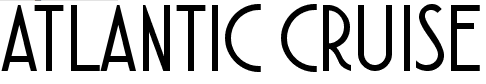


I was drawn to the H R Giger font. It is a bold, dark, serious, unusual and eye-catching shape, with sharp lines which would sit well alongside the knife blades (which is where we envisage placing the title shot). We received positive feedback for this font during our final crit. However, this is a poster font, and would not be suitable for use in body text.

Aside from choosing a font, we also need to consider how are titles, and indeed credits will be integrated into the animation. While sometimes it is appropriate for a title to sit against a black screen, in this instance we have been encouraged to try and integrate the titles, and make them a part of the art work. Title sequence design can be a job in itself (as I learned in last year's Applied Animation module), but in the case of a short 2 minute animation, I feel it would be gratuitous to have a separate title sequence, and it would be more appropriate to have a simple title, similar to that shown in 'A Close Shave'.

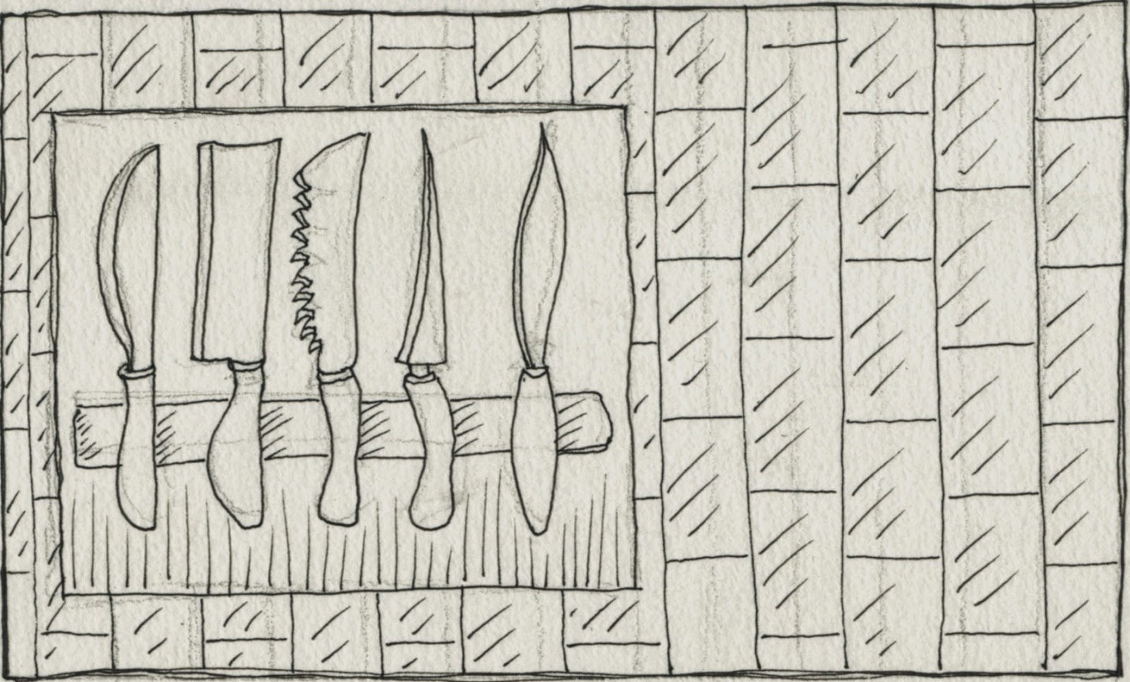
We envisioned our title 'Ignorance Is Bliss' appearing on screen as a knife is drawn off the knife rack and across the screen. However, as we were attempting to film this shot we had difficulty both in getting the camera to be at the right height, and moving the character smoothly. In short, the resulting footage was quite shaky. Consequently, we have discussed the possibility of using a still image of the knife rack and placing the title alongside. Depending upon the lighting of this shot, we may need to add a shadow to the title, or carefully consider the font colour, to make it stand out from the potentially quite dark and dingy surroundings.
No comments:
Post a Comment