Wednesday 30 April 2014

Editing

        As this is the most complex animation so far, it is the first time that I have had to contend with editing. The process of ensuring that the numerous shots flow together smoothly, without jarring, has been surprisingly tricky, and I have had to trim down some shots and change the pacing of others to eliminate unwanted pauses.
 
        Another unforeseen challenge was cutting down a two and a half minute piece of music to fit a 40 second title sequence, as inevitably the chosen section of the piece will not have a defined start/finish, or ease/out at precisely the moment you wish. To find the optimum beginning and end required a lot of trial and error, moving the music frame by frame.  
 
        Although the finished result is no doubt a little raw, hopefully with practice my editing skills will improve, and the results will become more professional.

Story Board Reshuffle

        While I was busy with the production process, it suddenly dawned on me that I had not made allowances in my story board or animatic for the title to appear, which is arguably fairly important within a title sequence. Fortunately, as I hadn't finished the production of some of the latter shots I had the opportunity to do a bit of reshuffling. From the research I have done, and the films I have watched, it seems that titles are usually on screen for three to four seconds, giving plenty of time to read them. 

        So I trimmed a few frames off each of the family tree shots, and reduced the number of blooming roses, as well as simplifying the sequence where the rose tendril are meant to encircle the crown, instead having two of the flowers eclipsing part of the crown. Consequently, I was able to incorporate the title into the sequence. 

Tuesday 29 April 2014

Watercolour

        Having decided not to use a graphics tablet, as I didn't feel comfortable I had enough time remaining to develop my skills to a competent level, I used watercolour and gold emulsion paint for much of my animation. In retrospect, this may not have been the best medium to choose, as it was not always possible to get the richness of colour seen in medieval illuminations and paintings, and the paint was not absorbed by the animation paper, so consequently in some areas the colour began to flake off. While I had not aimed for completely consistent colour, this unfortunately led to an increased level of 'flickering' when the frames were scanned in and assembled, particularly with the opening book.
 
Watercolour was not the best choice for the rich colour of  leather bound tome.
        The watercolour was better suited to the roses and vines, some of which I painted onto cartridge paper before digitally trimming and overlaying with the line drawings. This may have been a more suitable approach to take with the book sequence, and may have resulted in less discrepancy between the animated objects and their backgrounds. 

One of the hand painted frames from the flowering rose sequence.
 

Time Saving

        One of my main concerns with this project is how I can slim down the number of frames I need to create from a daunting 960 to a more manageable number. There are a number of ways this could be done, such as by working on 'doubles' for some sections, but I have also decided that I will create my backgrounds and animated objects separately. This is so that there is no need to redraw complex backdrops multiple times, although there is a risk that my animated objects will not look as much a part of the environment as if I had drawn them as one.
        I wanted (for the final shot of the roses encircling the crown) to use a detailed medieval tapestry as a backdrop, to connote the period, but was unable to find a suitable fabric to use as reference. Although it is anachronistic, I instead chose a William Morris print as a backdrop, as the deep colours do not detract attention from my central roses, while the flowers in the pattern subtly mirror the shape of the Yorkshire roses.

        I had also initially planned to depict the opening book sitting upon a swathe of red fabric, yet when I overlaid the animated sequence with a preliminary photograph of he fabric, the two did not appear part of the same image, with the book looking as though it was floating above the fabric. It needed a more level surface.

A photographic mock up of how I initially envisioned my opening shot.
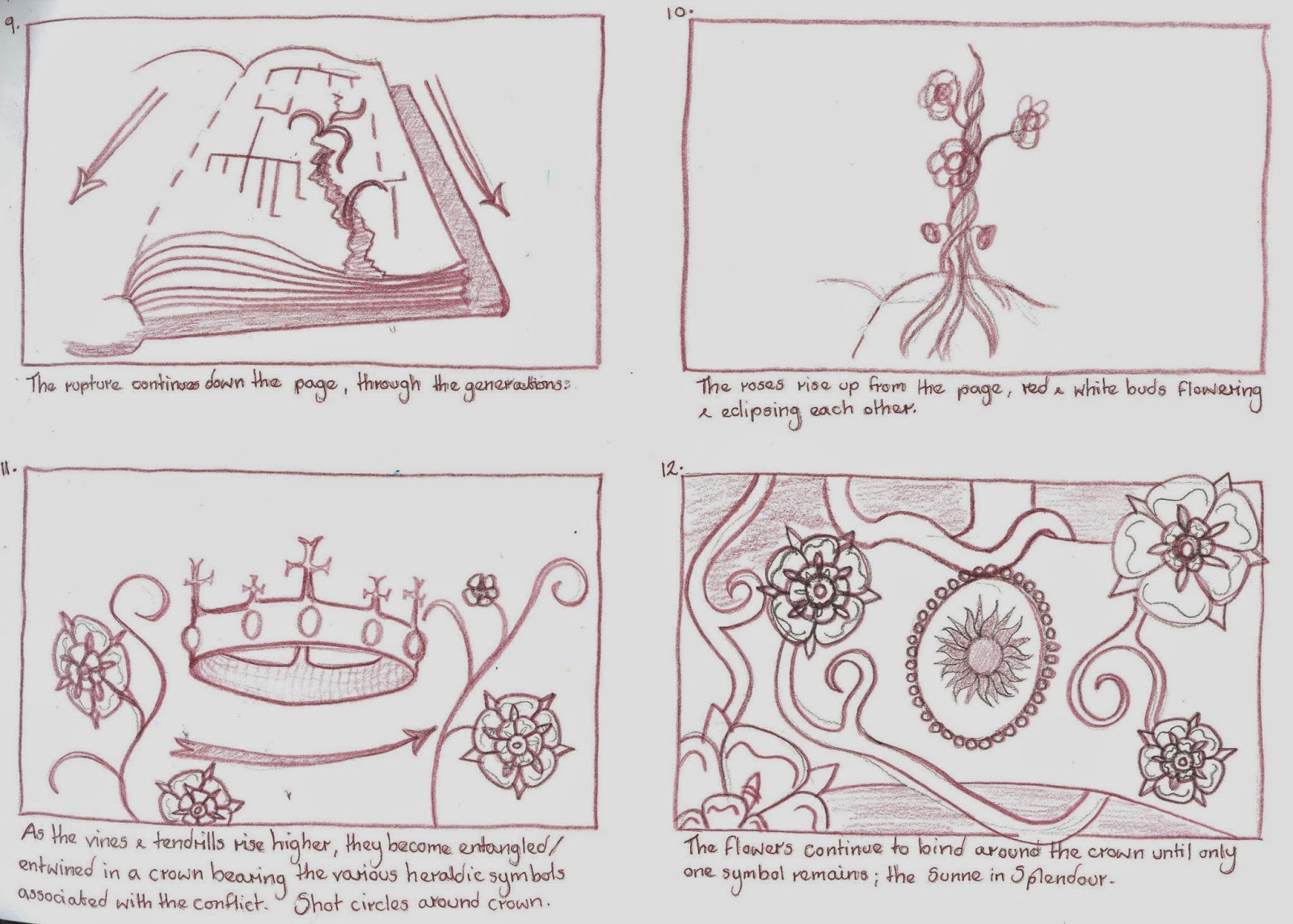
        Another way to improve my efficiency was to use After Effects for certain shot movements (such as panning and zooming without a change in angle) as well as to reuse the blooming rose multiple times, so that I was not redrawing similar movements unnecessarily. I was concerned at first that only showing the roses from the front would make them appear flat, but it is from this angle that they are most recognisable as the symbolic flowers of the Wars of the Roses, while the earlier stages of the opening flowers have greater depth and dimension.  

        Finally, a point that had been made during my interim crit was that my vision of having the writing of the family tree appear as though it were being written would be fairy time consuming and that there might be a better way to achieve this than drawing it frame by frame. Taking this on board, I wrote out each shot of the family tree only once, and used Photoshop to erase the writing a little at a time, before assembling these images into a sequence.        

Cast & Credits

        One of the key features of a title sequence is undoubtedly that it includes the names and roles of key cast and crew members, whether at the beginning or end of a feature. So, one of the more unexpected tasks in this project was deciding who should star in and direct my imaginary film. Once these decisions had been made, I chose to undertake some research as to how long each name should appear on screen, to give the viewer a fair chance of reading it.
 
        The answers were variable, as in some cases the director and lead actors appear on screen than more minor cast members, while multiple names appearing together are sometimes given not much more screen time than individual names. In general, two seconds seems plenty of time to read cast and crew credits, particularly as my sequence is only 40 seconds long, while the title should be given 4 seconds at maximum legibility. 

Monday 28 April 2014

To Paint Digitally Or By Hand?

        Before committing to hand drawing the entire 40 second animation, I felt it would be sensible to not only test my drawing style, but also how productive I would be. Below is a two second snippet, which I managed to complete in an afternoon. Based on this work rate, I believe I should be able to finish the hand drawn elements in good time.


        The next decision is whether to colour each frame in digitally, using Photoshop and a graphics tablet, or to paint it by hand. While I have seen some of my classmates produce incredibly detailed and in depth work digitally, it is not something I have much experience with. To remedy this I have had a few attempts using the tablet, but even were I to get used to drawing digitally, I don't feel that I have adequate time to learn how to create depth and texture using Photoshop on top of an already demanding work load. So, on this occasion, I have chosen to work within my comfort zone, using paints, inks and pencils, and devote time over the summer to learning how to pant digitally.

Music & Copyright

        After struggling to find the sort of music I envisaged for the title sequence, I was lucky enough to stumble across the we,bsite 8 Tracks, which for me (who's musical knowledge is not very vast) was an immensely useful library of mixes and playlists assembled by users according to genre and keywords etc. So fortunately, by searching for terms including medieval, epic, instrumental, I was able to come up with several music options to try alongside my animation.
 
        In order to legally use show my work publically with any of these options, I need to request permission from the copyright owner, most likely the respective record companies. However, the track that I feel is best suited to my title sequence is by a music production company named Audiomachine, who have written on their website that they actively encourage the use of their music in non monetised Youtube videos as long as they are acknowledged:
 
We get a lot of emails everyday from people asking to use audiomachine music in their YouTube videos.
Our policy is to allow the use of our music in non-monetized videos on YouTube. We actually encourage the use of audiomachine music in non-monetized videos on YouTube and we will be updating this page frequently with additional free music downloads to give your YouTube videos that epic, audiomachine touch.
 
        As Youtube is likely to be the only place I would publically exhibit my work, for the moment this seems adequate. But I do understand that if I were to show the title sequence elsewhere, I would need to request permission to use 40 seconds of one of their pieces of music.

Friday 18 April 2014

Family Tree Part II

        Having already decided to simplify the tree given in the novel so as to hopefully lessen confusion, I chose to make further alterations while I was planning the layout. The main problem that I encountered was the fact that the final generation of the tree had too many members to sit comfortably and clearly alongside one another, as there are seven siblings in the York family. So, as the plot revolves mainly around three of the brothers, I chose to remove the four siblings less relevant to the conflict from the tree.


Music

       I have been having trouble finding appropriate music to accompany my title sequence. As the time period is definite, I felt that the music should strongly evoke the medieval period, or at least I didn't want to use modern or contemporary music. 
 
        As a starting point I asked a friend who studies music to recommend some period composers and styles to search for. They told me to look for consorts of lutes and recorders, and at the work of William Byrd and John Dowland. However, much of these pieces were too choral, and with a strong religious feel, whereas I was hoping for something bolder and more dramatic, to match the strong theme of war and battle. Ideally I would like something along similar lines to Ramin Djawadi's Main Title for Game of Thrones; instrumental but also rousing and emotive, as it will act as the introduction to a film, so needs to stand out, but also support the visuals.

Tuesday 1 April 2014

Sunne In Splendour Story Board & Animatic

        Having decided that the best purpose for my title sequence would be as an introduction to the integral conflict and central characters, the next stage was to develop a story board. I took inspiration from classic Disney films, such as Sleeping Beauty, which often begin with an opening storybook, by way of an introduction. Rather than a storybook, the title sequence will begin with a history tome opening upon the family tree, which is then ripped apart by rose stems, visually demonstrating the family divide of the Wars of  the Roses.


        Although developing an animatic from the storyboard was a difficult task, as figuring out the optimum timings for each shot is something that I struggle with, I find the animatic an invaluable tool during production, as it helps me plan, particularly with pose to pose animation, as I can plot where each frame should come.

Medieval Script

        As the family tree is at the centre of my title sequence, it is important that I get the look right, taking into consideration the typography, wear and tear to the page it is written on etc. So I have researched various different medieval fonts, which originate from various points within the medieval period (I'm looking for late medieval/early Tudor) to give myself plenty of choice in order to make an informed decision.

        What they all have in common is that they are all incredibly ornate, and to a layman are distinctively medieval. However, some of the earlier typefaces are a little too rounded and Celtic looking for me, which allowed me to narrow down my options slightly.


        To decide between the remaining three fonts, I chose to test them out by writing three of the key names from the family tree, and see which gave the most convincing result. I tried each typeface in both upper and lower case, and have come to the conclusion that all upper case is too busy and intricate and actually makes the name harder to read.

        Of the three (2nd page) I am most drawn to the set on the right, as it is both legible but also decorative. However, something to bear in mind for the actual tree is the spacing of the letters as well as whether they are level. It would be sensible to draw out a guide to make sure that the letters do not become bunched up, as some have in these tests.

Family Tree

        Taking my cue from The Game of Thrones and its educational globe trotting around the fictional realms in which the story is set, I have chosen to use a family tree as the centrepiece of The Sunne in Splendour title sequence. I began by looking at the family tree provided in the novel.

 
        As you can see, this tree is quite busy, and incorporates family branches that figure in the novel but are perhaps not so significant to the backstory of the wars. At any rate, their significance is explained within the actual plot, so in order to simplify the tree and make it more accessible to an audience I think that it would be sensible to remove the Neville faction from the tree and simplify it down to the houses of York and Lancaster, allowing the depiction of the divide to be as clear and uncomplicated as possible, before introducing even more characters.
 

The Model- Clay

      I have numerous frustrating memories of working with clay in the past, with it either being too wet and slimy to hold its shape, or so dry that it cracks and crumbles; so all in all I can't say I was that excited at the prospect of working with it again. However, as part of our ceramics induction workshop, we were tasked with creating a larger scale model, using earthenware clay, of our character's head.

        The initial process of creating a hollow head from a ball of clay began to change my opinion of the material, and cross hatching and applying slip to adhere two pieces of clay together was less messy than and more successful than anything I had never been taught before. But once the basic shape had been created, and we had moved on to crafting the finer facial details, the old problems began to recur. As I reworked areas again and again in an attempt to create the perfect nose or mouth, the clay became softer and softer and began to cave in on itself, not helped by the hollow structure. This also made it difficult to contour the face or make the eyes, as there was only a centimetre or so of clay to make indentations in.

        Admittedly, the detailed and realistic design I had chosen for the character's face had made my task more difficult than it needed to be, and I had accepted that my modelling skills would not be able to match my drawing abilities on my first attempt. But I still feel that had we been modelling in plasticine, I would have been able to maintain greater control than with clay, as the former is more forgiving and easier to manipulate.

        Yet despite all of this, I intend to persevere with clay, and hopefully improve my skills in modelling with it, as it is no doubt an important material, particularly as armatures, and puppet and model making is the area of animation that I am most interested in.

Roses

        As the white and red roses of York and Lancaster are focal points of my title sequence, effectively serving as visual representations of the characters/two sides of the conflict, it was important to get their design right. The dilemma was whether to depict them as 'real' roses or as the more stylised symbols that have become associated with the Wars of the Roses and are still used (at least in Yorkshire) today.
 
A example of the White Rose of York, Lendal Bridge, York.
       
 
        As in the grand scheme of things, 40 seconds is not that long to convey the detailed backstory which has led to the events of The Sunne in Splendour I think that the best option would be to use the more stylised, heraldic roses. This is due to the fact that they should more readily evoke the context of the story, having a more immediate association with the medieval time period, war, and family conflict. However, I could still incorporate elements of more realistic roses into the animation, as I intend to show the flowers unfurling from buds, so it would be to my advantage to study footage of real roses.