Wednesday, 15 October 2014

CG Animation in Children's TV

        I recently came across a number of articles on social media protesting the fact the toy giant Mattel has seen fit to change the appearance of much loved children's TV character Bob the Builder. Bob's makeover will see him transform from the familiar Mackinnon and Saunders puppet character into a barely recognisable younger and svelter chap. Although I have no great affection for the builder, as I never really watched, it is sad to see another in a string of characters receive an unnecessary CG upgrade.


        I am not suggesting that CG is inherently unsuitable for this demographic (Strange Hill High uses an effective compination of puppetry, stop motion and digital imagery, while Little Charley Bear and Mike the Knight are both appealing CG creations), nor am I clinging to my own childhood memories of these programmes. Update the storylines by all means and make them relevant to the current generation of children, but does that have to mean replacing the puppets with technology? It's a shame to bring established and successful characters into the computer age just because we can, especially if it means sacrificing some of their charm along the way. 

        What has been contributed to the likes of Thomas the Tank Engine, Postman Pat and Fireman Sam by this transition? There has been a considerable amount of backlash, and at least to my mind these programmes have lost some of their tactile appeal. In puppet form, these characters seemed to inhabit their own miniature but nonetheless real worlds, which children could replicate in the world of play. The computer generated versions seem a little more false, more sterile and featureless.

        Even more confusingly, it is not as though CG has become the go to medium for children's programmes. Looking at CBBC's listings, there are a number of shows (Rastamouse, Little Robots, Raa Raa the Noisy Lion and Shaun the Sheep) which continue to use stop motion animation, raising the question why change the classics? What is the reasoning behind such a move? Oddly, I could't find any reasoning or justification for Bob's transformation in any of the news articles I read.

Maya: First Impressions

        While some of my classmates seemed to take to Maya relatively easily, I struggled a great deal to get to grips with the numerous functions and controls which allow us to manipulate and animate the 'Moom' character we will be working with for this module. Consequently, while some people chose to immediately begin piecing together simple animations, I felt I needed a little time to practice working with the Maya.


        One of my main problems was that at first I didn't realise that I needed to change the transformation selection (w = translate, e = rotate etc.) before each movement of a joint. It was also not always clear which joint needed manipulating in order to achieve certain poses, while, frustratingly, some transformations do not always seem to work for all joints.


        In spite of these teething issues, I am looking forward to building my skills with Maya, while the fact that we have been provided with a ready made character alleviates the pressure of having to come to terms with modelling at the same time as animating using this program. It also allows us to more closely focus on building our animation skills without being distracted by character deign. The fact that the entire group is using the same character with minimal features means that we must work hard on building a strong performance to imbue 'Moom' with appeal and personality. 


Character & Narrative

        For the Character & Narrative module we are required to select and self record a short (15-20 second) song lyric to use as a framework for animating a basic character in Maya. Although I was disappointed that this module doesn't offer the opportunity to develop and design our own characters, it does provide a welcome opportunity to develop our performance skills (important, as animators are essentially actors who perform through their creations). While a character's appearance can provide clues as to their role in a narrative, their performance and body language is equally, if not more, important.

        Character & narrative are intrinsically linked, not just in animation but across all areas of film. An interesting character that appeals to the viewer enables them to invest in the narrative, which a character's behaviour can drive the narrative. For example, hesitating before an action could be a powerful tool for heightening tension; behaving shiftily could create suspicion around a character. It is the job of the animator to pick up on subtle body language that the audience can pick up on and interpret. 

        Once we have decided on our lyrics, in order to imbue our generic character with an individual personality we will need to study how people move in everyday life to covey a sense of realism that the viewer will recognise and identify with. How do people move? How does this movement change depending on mood and emotion? Although we will be creating a simple prop for our character to interact with, and including a level of facial animation, the majority of the communication will fall on the character's performance. It will be interesting to see at the end of this module the diversity of characters created, despite the fact we will all be using the same CG model.


Monday, 12 May 2014

The Model-Plasticine Sequence

        Aside from creating armatures, during the 3D workshops we were set the task of depicting the transformation of a plasticine shape into another shape, in ten stages. I chose to show a sphere melt into a plasticine puddle, as often happens in morph sketches.


        Despite the apparent simplicity of my chosen shapes, there were hidden complexities, predominantly that the 'puddle' needed to spread in the right direction for each stage. Once I had achieved this with each separate model, it was important that they were lined up correctly to be photographed, for the sake of consistency and continuity. To help in this respect, I drew an outline around each plasticine shape as I photographed it, so that the next could be placed in the closest possible position.

        As one of my first forays into claymation, it is not exactly creative, but I am pleased with the result, and enjoyed working in this medium.

The entire plasticine sequence.


Sunday, 11 May 2014

Sir Gawain & the Green Knight

        While browsing through a book on drawing for animation, I came across a couple of stills from Tim Fernee's adaptation of the Arthurian legend of Gawain & The Green Knight. What was striking about these images was that they were drawn in the style of stained glass, with bright colours and strong lines. 

        
        Consequently, with just a glance one can deduce the Olde English period. Ideally, I would have liked to develop just such a distinctive style; with a far more extended production schedule I would have considered adding embroidery, to suggest a tapestry, or maybe used textured fabrics (as in A Series of Unfortunate Events) to similar effect.

Juno

        Gareth Smith's (Shadowplay Studio) title sequence for Jason Reitman's comedy Juno is unusual in that it occurs after an opening scene, but shows Juno's journey from home to the pharmacy, before the live action story picks up once again. The sequence begins and ends with seamless edits between the film and painstakingly hand drawn, collaged and traced animation.


        The effect of following Juno on her journey is that she is rooted firmly in the centre of the story, as she is pretty much the only human figure seen in the sequence, and her photographic appearance stands out from the flat colours and lines of her surroundings (to me the environments are reminiscent of the work of Patrick Caulfield). The interesting amalgamation of animation techniques reflects Juno's own quirky outlook, setting the tone for an oddball comedy. There was an immense amount of work involved to achieve an almost scrap book aesthetic, in which Juno almost seems to float rather than walk. Many, many photos were taken of Ellen Page walking, which were than coloured, photocopied repeatedly (to fade and degrade the image) before being cut out and assembled as deliberately stilted stop motion sequences. However, the picture book line drawings act as a reminder that behind her quick wit and ostensible bravado, Juno is at heart still a child forced to go through a difficult period  

Lemony Snicket's A Series of Unfortunate Events

        Another animated title sequence which has hints of Lotte Reiniger's cut out style is Lemony Snicket's A Series of Unfortunate Events (Jamie Caliri, Benjamin Goldman and Todd Hemker). Unlike Enchanted the effect here is rather more sinister, with the villain of the piece, Count Olaf, represented as an imposing, omnipresent, shadow puppet style figure that the Baudelaire orphans are powerless to escape. 


        Olaf's only feature not disguised beneath the demonic, Victorian-esque silhouette is the eye; a recurring symbol within the novels on which this film is based, as well as in the title sequence, a metaphor to show that the children are constantly being watched. The eye acts as a transition and link between the numerous vignettes that comprise this unusually lengthy end credits sequences (it runs for more than 5 minutes), for example a close up of an eye sees the iris transform into a Ferris wheel on which the children ride


        The sequence seems to comprise various different animation techniques, at some points using a more graphic style and at others appearing like a puppet theater, with waves and hills moving in distinct and separate layers. This is echoed by the figures of the orphans, whose jilting movements almost suggest stop motion. These different techniques are blended seamlessly thanks to the unchanging designs of the children, and to the plethora of rich patterns and fabric textures which were scanned in and used throughout, adding welcome depth to the otherwise flat imagery, which the aforementioned multi plane scenery also helps to combat. The desaturated and monochromatic colour palette that runs throughout also helps to tie the various elements together, as well as matching the colours used in the film, which give a strong impression of the grim and cheerless mood of the piece.

        There is a pleasingly hand crafted feel to the whole sequence that fits in nicely with the indeterminate period and vintage/steampunk aesthetic.

Saturday, 10 May 2014

Enchanted

        Although Disney's Enchanted subverts the studio's usual fairytale conventions, with the Princess' endless optimism and singing grating on the nerves of a cynical New York lawyer, the end credits title sequence by Yu+Co reverts to a more familiar style.


        The closing book that begins the sequence mirrors Disney animations such as Snow White and Sleeping Beauty which begin with an opening book, before the illustrations segue into the animation, a convention pastiched at the beginning of Shrek. In the case of Sleeping Beauty the book serves a greater purpose than to reference the story's fairy tale beginnings; the illustrations clearly suggest a medieval, almost tapestry style, immediately establishing the period for the audience.

     
        With Enchanted the hand drawn and watercolour illustrations are more reminiscent of Lotte Reiniger's cut out animations than the Disney house style, but the familiar scenes make reference to past Disney films as well as events within Enchanted, with little mermaids, horse-drawn carriages, waltzes, apples and dragons all making an appearance. This affectionate homage goes someway to remedying the subversion of the archetypal fairy tale, in which the Prince is slow witted and redundant and the Princess' charm ineffective in the contemporary world. Despite these unusual plot twists, the characters mange to find their own unique 'happily ever afters' and the traditional end credits animation reflects that despite the ostensible differences, the message is universal.


X-Men First Class

        In contrast to the majority of superhero films, many of which opt for high tech, CG heavy title sequences, to reflect its period setting, 40 years prior to the events of the original X-Men series, Matthew Vaugn's X-Men First Class resorts to a more retro animation style. Paying tribute to Maurice Binder's work on title's such as Dr No, Prologue's titles use similarly bold graphic shapes. However, rather than abstract patterns, the shapes are arranged to look like dividing cells, double helices and chromosomes, mirroring the franchise's central theme of genetic mutation.


        That Simon Clowes' designs for First Class so strongly echo Binder's work is apt considering that it is set in 1962, the same year Dr No was released, and that the plot is strongly linked to the Cold War, a theme shared with early Bond films. 

        In contrast to Clowes' slick and stylish approach, Kook Ewo's concept (realised by French visual effects studio Chez Eddy) for Splice chose to present similar themes from a more realistic perspective. Both films revolve around genetic mutation, although the latter concerns deliberate genetic modification in the world of science. The use of CG allowed Ewo to design a sequence that follows the contours of what one assumes to be an unborn foetus, although the claustrophobic closeup never allows us a full view of the abhorrent creature. Instead, the audience is allowed to closely see various different skin textures, some appear human, others reptilian or even like the surface of a leaf, all thin enough for a network of veins to be visible beneath. At any rate, this is probably closer than most people would care to see, but sets the mood for the challenging and uncomfortable film to follow. 


        The difference in the two title sequences can be attributed to the discrepancy between the films' tones. With X-Men, the focus is not on the science, but rather the fictional super abilities the characters possess, and their struggle to coexist with the rest of humanity. Splice, on the other hand, approaches a cautionary tale about the dangers of genetic modification through the use of horror and suspense. Everything from the foreboding soundtrack, grim green colour palette, organic shapes and somewhat nauseating imagery set Splice's titles apart from the energetic and colourful X-Men sequence, which in spite of its scientific references, sticks to graphic diagrams and avoids the squeamish. 

Friday, 9 May 2014

Casino Royale

        Daniel Kleinman's title sequence for Casino Royale manages both to conform to and subvert what has come to be expected from a James Bond film. Inevitably, one expects female nudity and objectification to match 007's somewhat misogynistic tendencies; women dripping in oil for The World is Not Enough, encircled by fire in Goldeneye, and buried beneath a desert in Quantum of Solace. The women are still present, although as the most recent 3 films seek to relieve James Bond of some of his more unfavorable attitudes towards women, it is in a less prominent capacity. 

        Instead, Kleinman uses animation to imbue the the titles with a sense of the film's nature. Alongside the expected iconography of guns, with Casino Royale there is a heavy emphasis on gambling and cards to support the central narrative (which sees Bond take  down his nemesis via a high stakes poker game). The way in which the silhouetted figures, their surroundings and even their weapons are revealed to be comprised of diamonds, spades, clubs and hearts is mesmeric and highly creative, as is the use of pouring hearts to show a wound. 


        In terms of an animated sequence this is quite complex, certainly more so that those of Studio Deubal, but again it's suited to the more frenetic pace of a spy film, and the fact that threats approach Bond from all sides. Upon closer analysis it could be seen to reflect Bond's character flaws; gun cross hairs becoming roulette wheels and bodies bursting into hearts and diamonds suggest that Bond's only passions/talents are killing and gambling, or that perhaps the two are interconnected in his mind? 

        This sequence builds upon Kleinman's previous live action piece for Die Another Day, which began to reveal 007's vulnerabilities, and leads into his most recent for Skyfall, which is perhaps the most personal and revealing of Bond's psyche; it follows him to his past and childhood home, both of which are previously unexplored areas, revealing hidden wounds and weaknesses as he takes a metaphorical trip through the underworld to emerge a more world weary and less indestructible character than the audience is used to.


        While Skyfall uses experimental and advanced technological methods, creating mesmerizing fluid animation and combining live action with animated and graphic imagery almost seamlessly, Casino Royale stands out for its use of a more traditional 2D silhouette animation. Not only does this more timeless style suit the fact that the film takes Bond back to the beginning of his career, out of sync with previous films in the franchise, but also pays respect to Maurice Binder's early Bond titles, such as Dr No (the first in the franchise), which used strong graphic shapes in abstract patterns. 

I read a study that showed that people who were familiar with a story before being told it enjoyed it more and perhaps, in a subtle way, the titles perform that function.
- Daniel Kleiman


Priceless

        As I have previously mentioned, sometimes a minimalist approach to an animated title sequences can be highly effective. For Pierre Salvadori's Priceless, studio Deubal's white on black animations capture the essence of the chic french riviera setting. The elegant yet also slightly haphazard lines and bouncy musical soundtrack suggest the upbeat, mischievous tone of the film, while the considered use of pattern on suit sleeves and umbrellas adds to the air of opulence already established by champagne flutes and diamond rings.


        The well chosen style and imagery is so well suited to it's purpose that there is really no need to overwhelm it with excessive amounts of animation. There is just enough movement as there needs to be; the diamond ring dropped into a glass to show our heroine's (?) gold digging ambitions, and a beach parasol is plucked from the sand and transformed into a cocktail umbrella to adorn her hair, echoing a pivotal moment of the film. This well judged simplicity is something I could learn from, as I have a tendency to over complicate, and underestimate the power of subtle movements.

        Studio Deubal have form with whimsical and lighthearted titles, applying their understated approach to sequences such as Apres Vous and Crustaces et Coquillages. The former features clumsy penguins (representing a waiter character) going about their duties, although the screen is dominated by bright colours and the credits, rather than the animation. The latter showcases shimmering ribbons (as though they were made of water) entwining to spell the title, while an assortment of similarly shimmering sea creatures frolic within the letters. These pleasantly languorous images are matched by a dreamy soundtrack, on which the lead actress sings softly in french of seafood and the beach; all in all combining to depict an idyllic and tranquil  impression of the Cote d'Azur setting, and the film's frivolous nature.


        By carefully considering the animation, and not allowing it to become over complicated and draw all of the audience's attention, the credits in Deubal's title's re not overwhelmed, and the cast and crew are given their moment in the spotlight. Yet the balance is just right, as the mood and tone of the films are still effectively set.

Thursday, 8 May 2014

Coraline

        The opening of Laika's Coraline works well as an introduction on the first viewing of the film, but arguably makes more sense on repeat viewings. The initial impression the viewer takes from watching the spider-like fingers made of needles unstitch and then reassemble a doll is one of unease, which prepares the audience for a sinister tale. The mutilation of the doll (symbolic of childhood and innocence) sets out the films intentions; being a child does not protect you from danger, while also attaching dangerous significance to the usually innocuous item, buttons.
        Having watched the entire film, the importance of smaller details becomes apparent. The form the doll takes before it is transformed is recognisable as the previous victim of the 'other mother' whose needle hands are initially disguised behind an ominously sweet façade, and that the doll is altered to resemble Coraline shows her to be the next. Consequently, rather than just being an introduction to the story, or a way of 'conditioning the audience' (Saul Bass), Coraline's title sequence is more a part of the story, albeit a part we wouldn't normally see, as the rest of the film is shown from Coraline's perspective.


        This is not the first time that a Laika production has used a title sequence that is an inseparable part of the film. The opening of Tim Burton's Corpse Bride depicts central character Victor's study of a butterfly, before the creature is released and the story begins. This serves as a valuable introduction into the sensitive and bookish nature of a character in a film where time is precious (the running time is a mere 77 minutes), while the rest of the characters and tone are established in the exposition.

        Laika's other well known animated feature Paranorman opens in a not too dissimilar fashion; Norman's affinity and interest in the supernatural being effectively shown as he watches an affectionate reconstruction/pastiche of a zombie flick. However Paranorman does have a more traditional title sequence in the end credits, utilising a style reminiscent of old B movie poster art work, interspersing still frames (when the credits are on screen) with minimal character animation to facilitate transitions between cretits.


        Overall, what this suggests to me is that in the context of films with short running times, title sequences need to be appropriately succinct.

Wednesday, 7 May 2014

Saul Bass

        It wouldn't be right, when researching animated title sequences, to neglect to mention Saul Bass. Not only was he responsible for famous titles for films such as Hitchcock's Vertigo and Preminger's Anatomy of a Murder to name but a couple, but his far reaching influence on the world of design has shaped more recent title sequences for films as diverse as Spielberg's Catch Me If You Can (Nexus Productions) and Pixar's The Incredibles.


        Bass' distinctively graphic paper cut out animations, with strong shapes and bold colours, are highly evocative of their late 1950s/1960s period, which may explain why their influence can be seen so prominently in films which seek to suggest a retro feel, or replicate this time setting. This is certainly true of The Incredibles, which attempts to recapture a bygone era, at the height of comic book and spy film popularity; an atmosphere to which the graphic title sequence contributes. Catch Me If You Can similarly uses Bass-esque visuals to evoke the spirit of a former time, the film being set in the 1960s. Yet despite stylistic similarities, more recent titles do not often share the unsettling tone of Bass' work, often being more upbeat, almost pastiches of retro design.


        Bass' view on the function of a title sequence is clearly outlined in this quote: 'my initial thoughts about what a title can do was to set mood and the prime underlying core of the film's story, to express the story in some metaphorical way. I saw a title as a way of conditioning the audience, so that when the film actually began, viewers would already have an emotional resonance with it.' This is undoubtedly true; Bass' sequences serve to unnerve the audience, setting the tone for the dark and troubling tales to follow. However, with more and more films withholding title sequences until the end credits, their use in this capacity diminishes, as titles cannot set the mood or create anticipation after the event; perhaps in such eventualities their purpose is more to recapture the mood, or even create anticipation for any potential sequels.   

        Although these more typical Bass titles showcase complex sequencing, disorienting editing and hypnotic spyrographic imagery, some of his more subtle works are just as effective. Throughout the entirety of the Carmen Jones title sequence (Bass' first) the shot never moves from an illustrated rose framed by the flickering of live action flames. The duration of the sequence allows the potential meanings of these two combined images to be absorbed by the audience, implying a story of lust, love, danger and anger through apparently simple means.

Friday, 2 May 2014

Marvel

        The sheer volume of films based on Marvel comics means that the studio has had opportunity to explore a broad range of animated title sequences, although what the majority have in common is a strong sense of their respective superhero's identity. For example, Prologue's (a studio that has been involved with many of Marvel's titles) Iron Man sequence is centred around technical drawings and blue prints, reflecting Tony Stark's engineering skills, while The Avengers (method design) film uses iconic objects which represent the characters' skills and strengths; Thor's hammer, Captain America's shield, Dr Banner's glasses etc. The sweeping camera shots which encircle these objects are somewhat reminiscent of opening of Tim Burton's 1989 Batman, where similar camera movements travel around the contours of a three dimensional Bat logo, as though it were a inescapable maze, although in this film the effect is darker, suggesting the DC character's more troubled state of mind.    


        As both of these sequences appear at the end rather than the beginning of the film (a trend which is becoming more prevalent) they cannot really be said to act as introductions or insights into the characters unlike earlier Marvel films in which the sequences did appear at the start. An example that stands out is Sam Raimi's Spider Man and its sequel Spider Man 2. Both sequences are created by Kyle Cooper (for Imaginary Forces and Prologue, respectively), yet have noticeable differences. The first film combines imagery of spider webs with ethereal smoke resembling DNA strands, alongside snippets of the hero's and villain's costumes and aerial shots of New York skyscrapers. These fleeting glimpses offer clues about the upcoming film and create anticipation amongst the audience. On the other hand, while the second film retains the integral spider web imagery and even uses some of the exact same shots as the first, the overall style is more graphic, using illustrations reminiscent of the story's comic book roots. Also, rather than create anticipation for the upcoming film, the focus is more upon recounting key scenes from the previous film, which not only demonstrate Spider Man's origin, but also suggest Peter Parker's state of mind, and the toll his alter ego is taking on him.

        Although all of these sequences are animated titles, much of the movement comes from objects rotating, moving apart, or web strands eclipsing static illustrations, rather than complex action which may prove too distracting from the credits. The two elements sit comfortably alongside one another.

Thursday, 1 May 2014

The Model- Character Design

        Before starting work on our armatures, we had to draw out a design in order that we were able to create the right shape wire frame as a base. While some of my classmates chose to use character designs from the current Applied Animation module, my title sequence doesn't require any characters, and so consequently I didn't have and designs. Instead, I based my armature on a character from my foundation degree final project; an Edwardian/1920s beauty named Yasmin Howcomely, from Roald Dahl's My Uncle Oswald.

        However, since I didn't incorporate clothing and hair into the plasticine modelling, there is the possibility that my armature could be transformed into the lead female character from the novel I am basing the Applied Animation module on: Anne Neville, a medieval noblewoman. 


        In retrospect, after struggling to sculpt realistically proportioned features in my plasticine model, I realise that I should have taken initiative from the models created by Mackinnon & Saunders and Aardman, which use exaggerated shapes. While I used exaggeration for the body shape, it would have made my job much easier if my design had bigger eyes/lips, which were incredibly tricky to model on a small scale.


        Morph epitomises this simplified approach. The character is made up of a single colour, in a basic shape, with large eyes and minimal features. Wallace & Gromit, perhaps Aardman's most famous creations are more complex, with texture, clothing, fingers and more facial features. However their proportions are still cartoonish (similarly to the large eyed, spindly limbed characters Mackinnon & Saunders create for Tim Burton), which not only helps with characterisation and making each character more recognisable, but also assists the sculptors and model makers, as they are not striving for photo realism.

Wednesday, 30 April 2014

Editing

        As this is the most complex animation so far, it is the first time that I have had to contend with editing. The process of ensuring that the numerous shots flow together smoothly, without jarring, has been surprisingly tricky, and I have had to trim down some shots and change the pacing of others to eliminate unwanted pauses.
 
        Another unforeseen challenge was cutting down a two and a half minute piece of music to fit a 40 second title sequence, as inevitably the chosen section of the piece will not have a defined start/finish, or ease/out at precisely the moment you wish. To find the optimum beginning and end required a lot of trial and error, moving the music frame by frame.  
 
        Although the finished result is no doubt a little raw, hopefully with practice my editing skills will improve, and the results will become more professional.

Story Board Reshuffle

        While I was busy with the production process, it suddenly dawned on me that I had not made allowances in my story board or animatic for the title to appear, which is arguably fairly important within a title sequence. Fortunately, as I hadn't finished the production of some of the latter shots I had the opportunity to do a bit of reshuffling. From the research I have done, and the films I have watched, it seems that titles are usually on screen for three to four seconds, giving plenty of time to read them. 

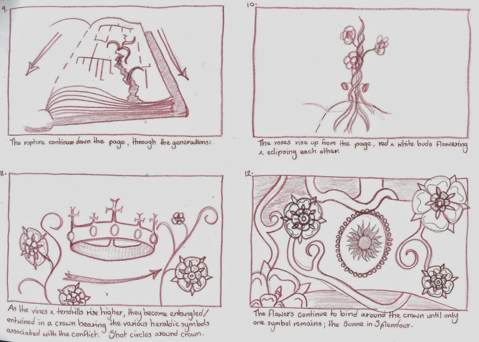
        So I trimmed a few frames off each of the family tree shots, and reduced the number of blooming roses, as well as simplifying the sequence where the rose tendril are meant to encircle the crown, instead having two of the flowers eclipsing part of the crown. Consequently, I was able to incorporate the title into the sequence. 

Tuesday, 29 April 2014

Watercolour

        Having decided not to use a graphics tablet, as I didn't feel comfortable I had enough time remaining to develop my skills to a competent level, I used watercolour and gold emulsion paint for much of my animation. In retrospect, this may not have been the best medium to choose, as it was not always possible to get the richness of colour seen in medieval illuminations and paintings, and the paint was not absorbed by the animation paper, so consequently in some areas the colour began to flake off. While I had not aimed for completely consistent colour, this unfortunately led to an increased level of 'flickering' when the frames were scanned in and assembled, particularly with the opening book.
 
Watercolour was not the best choice for the rich colour of  leather bound tome.
        The watercolour was better suited to the roses and vines, some of which I painted onto cartridge paper before digitally trimming and overlaying with the line drawings. This may have been a more suitable approach to take with the book sequence, and may have resulted in less discrepancy between the animated objects and their backgrounds. 

One of the hand painted frames from the flowering rose sequence.
 

Time Saving

        One of my main concerns with this project is how I can slim down the number of frames I need to create from a daunting 960 to a more manageable number. There are a number of ways this could be done, such as by working on 'doubles' for some sections, but I have also decided that I will create my backgrounds and animated objects separately. This is so that there is no need to redraw complex backdrops multiple times, although there is a risk that my animated objects will not look as much a part of the environment as if I had drawn them as one.
        I wanted (for the final shot of the roses encircling the crown) to use a detailed medieval tapestry as a backdrop, to connote the period, but was unable to find a suitable fabric to use as reference. Although it is anachronistic, I instead chose a William Morris print as a backdrop, as the deep colours do not detract attention from my central roses, while the flowers in the pattern subtly mirror the shape of the Yorkshire roses.

        I had also initially planned to depict the opening book sitting upon a swathe of red fabric, yet when I overlaid the animated sequence with a preliminary photograph of he fabric, the two did not appear part of the same image, with the book looking as though it was floating above the fabric. It needed a more level surface.

A photographic mock up of how I initially envisioned my opening shot.
        Another way to improve my efficiency was to use After Effects for certain shot movements (such as panning and zooming without a change in angle) as well as to reuse the blooming rose multiple times, so that I was not redrawing similar movements unnecessarily. I was concerned at first that only showing the roses from the front would make them appear flat, but it is from this angle that they are most recognisable as the symbolic flowers of the Wars of the Roses, while the earlier stages of the opening flowers have greater depth and dimension.  

        Finally, a point that had been made during my interim crit was that my vision of having the writing of the family tree appear as though it were being written would be fairy time consuming and that there might be a better way to achieve this than drawing it frame by frame. Taking this on board, I wrote out each shot of the family tree only once, and used Photoshop to erase the writing a little at a time, before assembling these images into a sequence.        

Cast & Credits

        One of the key features of a title sequence is undoubtedly that it includes the names and roles of key cast and crew members, whether at the beginning or end of a feature. So, one of the more unexpected tasks in this project was deciding who should star in and direct my imaginary film. Once these decisions had been made, I chose to undertake some research as to how long each name should appear on screen, to give the viewer a fair chance of reading it.
 
        The answers were variable, as in some cases the director and lead actors appear on screen than more minor cast members, while multiple names appearing together are sometimes given not much more screen time than individual names. In general, two seconds seems plenty of time to read cast and crew credits, particularly as my sequence is only 40 seconds long, while the title should be given 4 seconds at maximum legibility. 

Monday, 28 April 2014

To Paint Digitally Or By Hand?

        Before committing to hand drawing the entire 40 second animation, I felt it would be sensible to not only test my drawing style, but also how productive I would be. Below is a two second snippet, which I managed to complete in an afternoon. Based on this work rate, I believe I should be able to finish the hand drawn elements in good time.


        The next decision is whether to colour each frame in digitally, using Photoshop and a graphics tablet, or to paint it by hand. While I have seen some of my classmates produce incredibly detailed and in depth work digitally, it is not something I have much experience with. To remedy this I have had a few attempts using the tablet, but even were I to get used to drawing digitally, I don't feel that I have adequate time to learn how to create depth and texture using Photoshop on top of an already demanding work load. So, on this occasion, I have chosen to work within my comfort zone, using paints, inks and pencils, and devote time over the summer to learning how to pant digitally.

Music & Copyright

        After struggling to find the sort of music I envisaged for the title sequence, I was lucky enough to stumble across the we,bsite 8 Tracks, which for me (who's musical knowledge is not very vast) was an immensely useful library of mixes and playlists assembled by users according to genre and keywords etc. So fortunately, by searching for terms including medieval, epic, instrumental, I was able to come up with several music options to try alongside my animation.
 
        In order to legally use show my work publically with any of these options, I need to request permission from the copyright owner, most likely the respective record companies. However, the track that I feel is best suited to my title sequence is by a music production company named Audiomachine, who have written on their website that they actively encourage the use of their music in non monetised Youtube videos as long as they are acknowledged:
 
We get a lot of emails everyday from people asking to use audiomachine music in their YouTube videos.
Our policy is to allow the use of our music in non-monetized videos on YouTube. We actually encourage the use of audiomachine music in non-monetized videos on YouTube and we will be updating this page frequently with additional free music downloads to give your YouTube videos that epic, audiomachine touch.
 
        As Youtube is likely to be the only place I would publically exhibit my work, for the moment this seems adequate. But I do understand that if I were to show the title sequence elsewhere, I would need to request permission to use 40 seconds of one of their pieces of music.

Friday, 18 April 2014

Family Tree Part II

        Having already decided to simplify the tree given in the novel so as to hopefully lessen confusion, I chose to make further alterations while I was planning the layout. The main problem that I encountered was the fact that the final generation of the tree had too many members to sit comfortably and clearly alongside one another, as there are seven siblings in the York family. So, as the plot revolves mainly around three of the brothers, I chose to remove the four siblings less relevant to the conflict from the tree.


Music

       I have been having trouble finding appropriate music to accompany my title sequence. As the time period is definite, I felt that the music should strongly evoke the medieval period, or at least I didn't want to use modern or contemporary music. 
 
        As a starting point I asked a friend who studies music to recommend some period composers and styles to search for. They told me to look for consorts of lutes and recorders, and at the work of William Byrd and John Dowland. However, much of these pieces were too choral, and with a strong religious feel, whereas I was hoping for something bolder and more dramatic, to match the strong theme of war and battle. Ideally I would like something along similar lines to Ramin Djawadi's Main Title for Game of Thrones; instrumental but also rousing and emotive, as it will act as the introduction to a film, so needs to stand out, but also support the visuals.

Tuesday, 1 April 2014

Sunne In Splendour Story Board & Animatic

        Having decided that the best purpose for my title sequence would be as an introduction to the integral conflict and central characters, the next stage was to develop a story board. I took inspiration from classic Disney films, such as Sleeping Beauty, which often begin with an opening storybook, by way of an introduction. Rather than a storybook, the title sequence will begin with a history tome opening upon the family tree, which is then ripped apart by rose stems, visually demonstrating the family divide of the Wars of  the Roses.


        Although developing an animatic from the storyboard was a difficult task, as figuring out the optimum timings for each shot is something that I struggle with, I find the animatic an invaluable tool during production, as it helps me plan, particularly with pose to pose animation, as I can plot where each frame should come.

Medieval Script

        As the family tree is at the centre of my title sequence, it is important that I get the look right, taking into consideration the typography, wear and tear to the page it is written on etc. So I have researched various different medieval fonts, which originate from various points within the medieval period (I'm looking for late medieval/early Tudor) to give myself plenty of choice in order to make an informed decision.

        What they all have in common is that they are all incredibly ornate, and to a layman are distinctively medieval. However, some of the earlier typefaces are a little too rounded and Celtic looking for me, which allowed me to narrow down my options slightly.


        To decide between the remaining three fonts, I chose to test them out by writing three of the key names from the family tree, and see which gave the most convincing result. I tried each typeface in both upper and lower case, and have come to the conclusion that all upper case is too busy and intricate and actually makes the name harder to read.

        Of the three (2nd page) I am most drawn to the set on the right, as it is both legible but also decorative. However, something to bear in mind for the actual tree is the spacing of the letters as well as whether they are level. It would be sensible to draw out a guide to make sure that the letters do not become bunched up, as some have in these tests.

Family Tree

        Taking my cue from The Game of Thrones and its educational globe trotting around the fictional realms in which the story is set, I have chosen to use a family tree as the centrepiece of The Sunne in Splendour title sequence. I began by looking at the family tree provided in the novel.

 
        As you can see, this tree is quite busy, and incorporates family branches that figure in the novel but are perhaps not so significant to the backstory of the wars. At any rate, their significance is explained within the actual plot, so in order to simplify the tree and make it more accessible to an audience I think that it would be sensible to remove the Neville faction from the tree and simplify it down to the houses of York and Lancaster, allowing the depiction of the divide to be as clear and uncomplicated as possible, before introducing even more characters.
 

The Model- Clay

      I have numerous frustrating memories of working with clay in the past, with it either being too wet and slimy to hold its shape, or so dry that it cracks and crumbles; so all in all I can't say I was that excited at the prospect of working with it again. However, as part of our ceramics induction workshop, we were tasked with creating a larger scale model, using earthenware clay, of our character's head.

        The initial process of creating a hollow head from a ball of clay began to change my opinion of the material, and cross hatching and applying slip to adhere two pieces of clay together was less messy than and more successful than anything I had never been taught before. But once the basic shape had been created, and we had moved on to crafting the finer facial details, the old problems began to recur. As I reworked areas again and again in an attempt to create the perfect nose or mouth, the clay became softer and softer and began to cave in on itself, not helped by the hollow structure. This also made it difficult to contour the face or make the eyes, as there was only a centimetre or so of clay to make indentations in.

        Admittedly, the detailed and realistic design I had chosen for the character's face had made my task more difficult than it needed to be, and I had accepted that my modelling skills would not be able to match my drawing abilities on my first attempt. But I still feel that had we been modelling in plasticine, I would have been able to maintain greater control than with clay, as the former is more forgiving and easier to manipulate.

        Yet despite all of this, I intend to persevere with clay, and hopefully improve my skills in modelling with it, as it is no doubt an important material, particularly as armatures, and puppet and model making is the area of animation that I am most interested in.

Roses

        As the white and red roses of York and Lancaster are focal points of my title sequence, effectively serving as visual representations of the characters/two sides of the conflict, it was important to get their design right. The dilemma was whether to depict them as 'real' roses or as the more stylised symbols that have become associated with the Wars of the Roses and are still used (at least in Yorkshire) today.
 
A example of the White Rose of York, Lendal Bridge, York.
       
 
        As in the grand scheme of things, 40 seconds is not that long to convey the detailed backstory which has led to the events of The Sunne in Splendour I think that the best option would be to use the more stylised, heraldic roses. This is due to the fact that they should more readily evoke the context of the story, having a more immediate association with the medieval time period, war, and family conflict. However, I could still incorporate elements of more realistic roses into the animation, as I intend to show the flowers unfurling from buds, so it would be to my advantage to study footage of real roses.


Thursday, 20 March 2014

Peter Parr

        Whilst reading through Drawing for Animation, I noticed the work of Peter Parr. Unlike Quinn's work, where the soft pencil lines flow together to create fluid movement, Parr's life drawing sketches are made up of bolder, shorter lines. Rather than sketching the body as a whole, Parr's lines construct a figure in motion, creating more of an impressionistic expression than a fully realised drawing. In this way, he manages to give a detailed depiction of motion as well as physicality and the presence of the figure. 
 
        Despite the more impressionistic style of his sketches, Parr manages to capture the volume of his subject through carefully considered mark making. By varying the intensity or lightness of the line, Parr suggests weight and form, while maintaining the overall simplicity. Parr's work is also successful in communicating the characteristics and  gesture of his subject, the latter being an important tool for expressing attitude and feeling, and giving life and depth to animation.
 
        By not over working his life drawings, Parr allows himself to focus on the performance and motion, while his energetic strokes capture the rhythm of a movement, which form the basis of natural movement. Yet behind the ostensible simplicity, Parr's has vast skill in drawing and understanding the human form, that can only be achieved through practice. Without this skill and knowledge, it would be difficult to imbue the line with such meaning and presence, and so seamlessly record the energy of his subjects.